For the longest time website footers were like the proverbial junk draw. Website footers were designed to keep a few important things like copyright and maybe some contact information, but after that, it was a collection of things website owners never expected visitors to even think about.
The Meaning of Website Footer
Then designers and website owners became more aware of the value of SEO and website footer designs started carrying things that were perceived to deliver food for the search engines. These included things like site maps that were supposed to help search bots crawl through sites more effectively.
Even today, with a better understanding of how valuable this website territory is, website footer designs still come up short. They are often generic and fail to capture attention. It’s time to start seriously considering how valuable the website footer can be and start designing these gems with the same level of attention that every other portion of most websites enjoy.
Main 10 Website Footer Design Rules to Follow
Before we dive into some well-tested rules, let’s talk a bit about why the website footer is so important, and let’s start with the fact that an average of 57% of all website visitors will scroll down to the footer, even on exceptionally long webpages. This was uncovered in a larger study by the Nielsen Norman Group.
They typically scroll down looking for something in particular and they expect that bit of information will either be in the footer or can be found through a link in the footer.
If visitors are going to scroll down to the website footer they had better find what they’re looking for or you will be counting them as lost opportunities.
Here are some basic rules you should follow:
- Website footer content should still contain copyright details. This assertion of rights does provide recourse when others grab your content without permission. The structure used to be set in law but that’s no longer in play. Today, you can comfortably use the following format:
©2021-2022 – Your Name or Company Name – All Rights Reserved”The placement is commonly at the bottom right of the footer but this isn’t a rule. Let its placement fit with the overall design of your website footer.
- Be sure to include links to your Privacy Policy and Terms & Conditions. If you are building an e-commerce site add links to your Returns Policy and contacts for Customer Service. If you are storing cookies place a link to your Cookie Policy here as well.
- While some still advocate for the inclusion of a full sitemap, the strongest indications are that search engines don’t need the help. If you do want to include it consider simply adding a link to a separate sitemap page.
- Include your logo if your design doesn’t already make this always visible.
- Design your website footer to include the most important links on your site. If you’re running a blog this may be the latest or most-read blog posts. If you’re building an e-commerce site, this may include links to your latest or most popular products. For corporate sites, the website footer should include links to the latest company news.
- Your website footer should be eye-catching while also showing a clear delineation from the rest of the page content. Background colors and images are a great way to do this and effectively define the website footer as a unique content space.
- There is no hard and fast rule covering the size of your website footer. Some are relatively small while others will cover as much as half of the viewable screen area. The key here is to let your content dictate the size of your website footer.
- Keep your website footer well organized. Typically, these are designed in columns, and generally, the columns max out at 5. First, this width allows sufficient space for each section of content within the footer. Column design also helps ensure the footer will look good and work well on mobile devices as the columns get stacked.
- Don’t forget to include contact information and if you’re encouraging visitors to subscribe to your newsletter, put the subscription form in the footer too.
- Also, be sure to include share links in your website footer. This is a great opportunity to get the share that will drive your content up in the search results.
Some great Website Footer Example – Find your inspiration
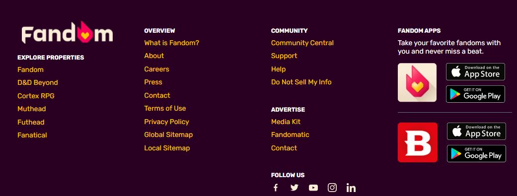
Fandom
This 4-column website footer design uses color to create a distinct footer section. It then varies the font colors and adds colorful icons to make the content pop. Their logo stands out and all of the most important content links are in place. They’ve also included quick links that make it easy for visitors to grab their App. Finally, the copyright information is present but placed so that it doesn’t interfere with any of the most important details.
The Wall Street Journal
This website footer has a clean design that is surprisingly packed full of important information, and while this footer design is more complex than would be needed for most websites, it does follow one of our most important rules. It contains all of the most important links and information any visitor will be looking for.
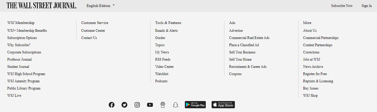
Then for good measure, they have added the ability to switch languages, a link for a subscriber to sign in, and a link to subscribe for those that haven’t yet. They have links to all of their social pages, along with links to all of their subsidiary and partner companies.
Shopify
Another excellent example of a website footer design is found on this business page from Shopify. It’s chock full of important links for anyone that is selling or is considering selling products on this platform. It is a well-defined space as well so there is no doubt that a visitor has arrived at the footer.
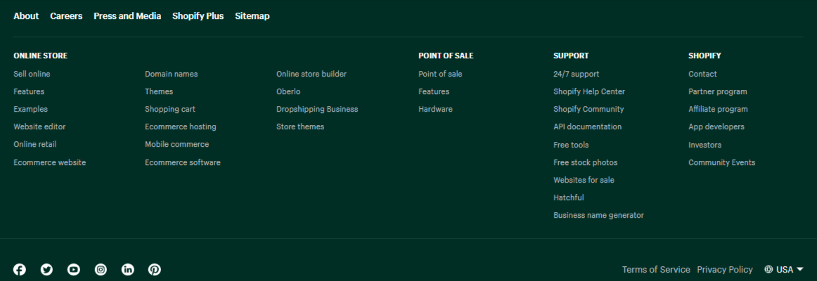
Note that a footer like this one, with 6 columns, doesn’t work well on mobile devices but the website designer solved this by tweaking the mobile design to include just 2 columns. With most website templates, this is as simple as changing a setting in the template’s responsive attributes and it ensures that the footer doesn’t become too long.
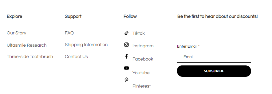
Ultasmile
This site takes a different approach to designing its website footer by keeping the background color the same as the page itself. The delineation comes with the inclusion of a horizontal dividing line and then the smaller font text to deliver the links for the Privacy Policy and Term of Service. The power of this website footer comes from the simple subscription process where an email address is collected and a single button is clicked.
In Closing
These four examples highlight the key design elements you’ll need to build an effective and informative website footer. Use them as your inspiration but don’t be limited by them. Use our footer design rules and these examples and then consider what will be most useful for your website visitor. What will they most likely be looking for in your website footer? What content will do the best job of converting that visitor into a customer or subscriber?
Once you have a good idea of what that content is, build your website footer and then track how it’s performing. Are you getting the clicks where you expected them or are they leaving the page without converting?
Now test your website footer design by changing things up. Take out those things that don’t seem to be delivering and add things that may do a better job. This is an exploration and while our rules and the samples we’ve included are proven to work, there is still plenty of room for tweaking every part of your website, including the website footer design.