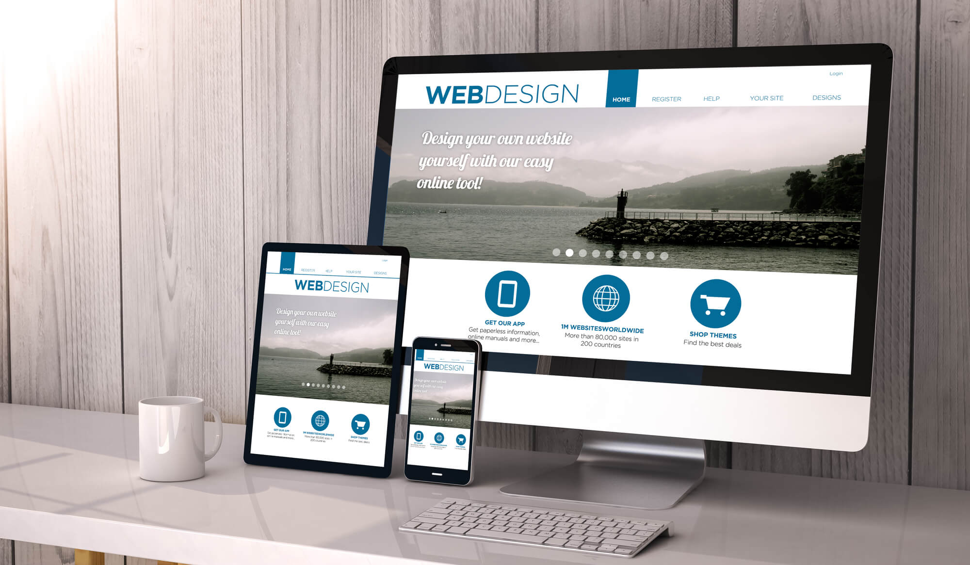
If you want your website to be successful and generate lots of traffic, you need to optimize it for mobile devices. It’s no secret that mobile responsiveness is vital for modern web design. After all, we live in the age of mobile technologies, and people use their smartphones to access websites more often than ever.
This is the reason why Google started to view mobile responsiveness as one of it’s crucial ranking factors. Thus, responsive sites have greater exposure on the search engine, and hence, more chances to get visitors. Since most visitors are mobile users, your site must ensure perfect user experience on smartphones.
If you want to get a better idea of mobile responsiveness, we’ve got some fantastic examples to help you master the basic principles of mobile UX design.
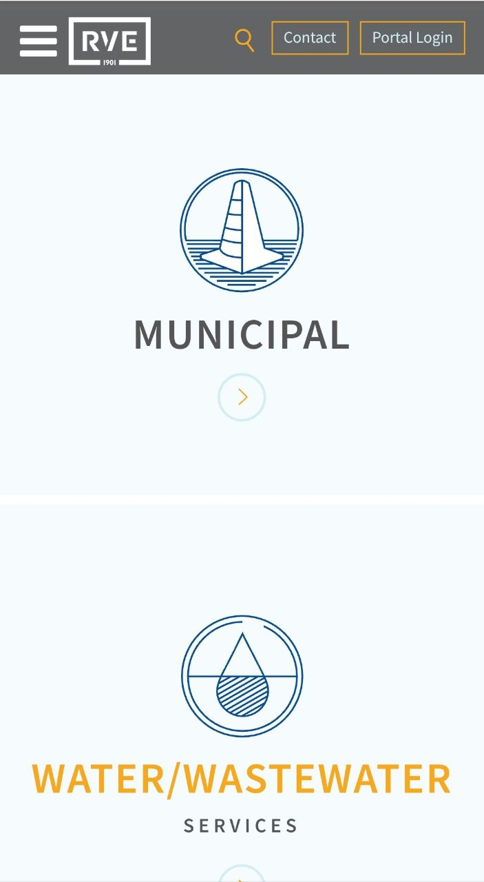
RVE – Remington & Vernick Engineers
Since smartphones have small and narrow screens, the desktop layout of website elements is simply not suitable for them. The solution is a vertical layout that allows smartphone screens to display content in smaller portions. The RVE website has nailed it perfectly.
While the desktop version of their site consists of horizontally-oriented images and navigation elements, the mobile version looks and reads flawlessly in the vertical arrangement. Images are scaled and adjusted to fit the narrow screen space, and the text is centered to ensure good readability.
The tiles for easy access to different service categories on the homepage are also placed vertically, one after another (instead of a grid-based structure used in the desktop version). The main navigation menu is effectively hidden behind the hamburger menu icon. All these details make the mobile design of the website complete and consistent with the original desktop version.


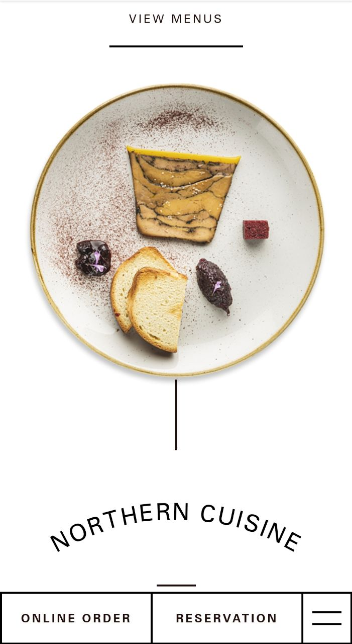
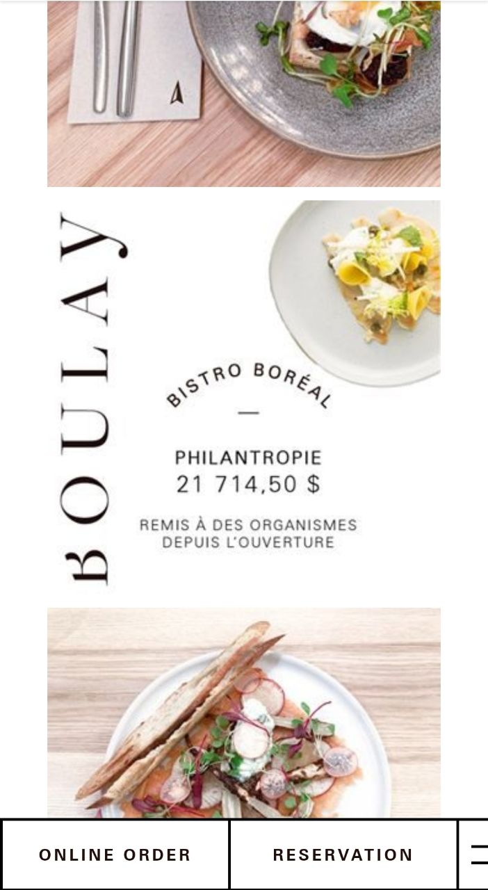
Boulay
Boulay has a beautiful, minimalist website filled with eye-catching visuals and elegant animations. Despite the chaotic layout of the desktop version, its mobile design managed to preserve the style without hurting the usability.
Irregular layouts are known to be problematic for mobile screens as they are impossible to display correctly on narrow screens. That is why Boulay applied a more traditional vertical grid to its mobile site. At the same time, they kept their mellow animations (like the spinning dish in the center of the homepage) to make the user experience more enjoyable.
As for navigation, Boulay kept it as simple as possible by only leaving three essential buttons at the bottom of the screen.

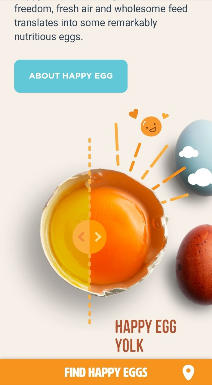
Happy Egg
Happy Egg’s desktop website is a lot of fun! It is interactive and features lots of neat images, embedded videos, and animations. Just look at how the border of the fullscreen video on the homepage fluctuates, reacting to the movement of your cursor!
However, all these bells and whistles are a bit overwhelming for mobile devices. And yet, Happy Egg did a great job optimizing the website’s mobile version. They removed some of the secondary videos and animations, but kept the essential ones intact.
As a result, the site remains lively and fun while also being quick to load. Some interactive elements have also made their way to the mobile website, like the movable curtain that allows users to compare Happy Egg yolks to regular yolks, as well as the pasture map with embedded mini-videos.
Plus, they pinned their call-to-action button to the bottom of the screen. Thus, no matter whether you scroll the page up or down, the main CTA will always be within a thumb’s reach.


Xavio Design
What makes the Xavio Design website so good is that its mobile version looks and feels almost the same as the desktop version. Despite the changes in the layout, which are necessary to display content correctly on smaller screens, the site maintained its original look, fluid animations, and perfect usability.
The letters of headings that emerge gradually on pages and the way images pop up on the screen look gorgeous on both desktop and mobile, giving the site a professional and luxury feel.


Think Global Health
If you take a look at the desktop version of their website, you will find that it has the classic look of a typical information-based website. Yes, it has lots of textual content mixed with photos. This kind of layout is common for news websites and educational websites because it is focused on presenting larger chunks of information rather than marketing or converting visitors.
If you own a similar type of website, you might be interested in how Think Global Health managed to squeeze all of the content into the small screen of a smartphone. Thanks to the simplistic design, linear layout, and plenty of whitespace, the content is displayed correctly and has perfect readability. You can easily scan the pages without straining your eyes.
Navigation controls are hidden behind the menu icon in the top left corner of the screen, so the visitor’s attention can be fully focused on the content.


Aidentity
Aidentity presented its own vision of style and usability in modern web design. The most remarkable aspect of it is the single-screen structure of its homepage. This means the page doesn’t scroll down as usual. Instead, scrolling causes content to change on the same screen, which is accompanied by a cool 3D animation.
The same structure is preserved on the website’s mobile version. And it seems to work splendidly! This appears to be a great way to accommodate all of your on-page content “above the fold” to make your content presentation more focused. It also ensures that visitors have all the essential information right in front of their eyes.
The rest of the pages are scrollable but rather short. They feature amazing hero images and headings with trendy glitch animations. For better convenience, you can access any page immediately through the hamburger menu beside the Aidentity logo.


Riangle
Minimalist design is still a widely-accepted trend, and Riangle makes use of it in both the desktop and mobile versions of their website. It features minimal text, images, and color. Even fonts are pretty humble. However, this simplicity works perfectly for the website’s appearance and usability.


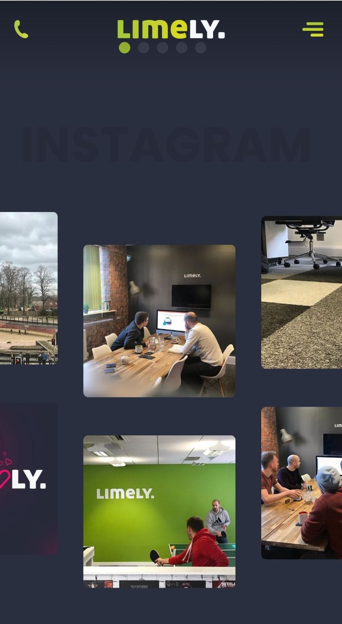
Limely
Limely’s website is all about stunning visuals: eye-catching images, smooth animations, and a pleasant color scheme. In addition, their layout helps create a perfect balance between the visual and textual content.
The mobile version of the website maintains the same level of visual impact. Although they had to simplify that gorgeous cinemagraph that appears as their hero image, the mobile site looks and feels as good as the desktop version (which is exactly the result you’d want to achieve with your mobile design).
Another decision that deserves applause is that they show the animated social media feed on the homepage. With its help, mobile users can go to Limely’s Instagram channel by simply tapping on the photo in the carousel.


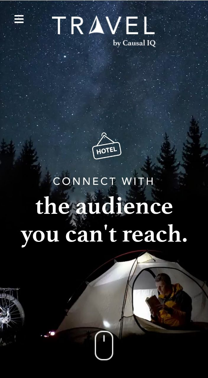
Travel by Casual IQ
This site sends you on a journey across multiple screens filled with excellent illustrations and animations. The home screen features a fantastic cinemagraph, and the following screens make use of trendy isometric motion graphics that totally captivate the viewer. What’s more, the screens change in different directions (not from top to bottom as on most websites), which gives the site a multidimensional feel.
The mobile version of the website is almost as amazing as the desktop, but apparently, it needed a bit of simplification to suit less powerful mobile devices. Thus, the cinemagraph on the homepage was turned into a static image, as well as major animations on other pages. However, smaller animations were kept unchanged. Scrolling on the mobile version was also simplified, so the screens move in a typical manner, from top to bottom. But the whole thing still looks fascinating!


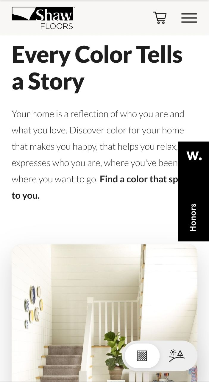
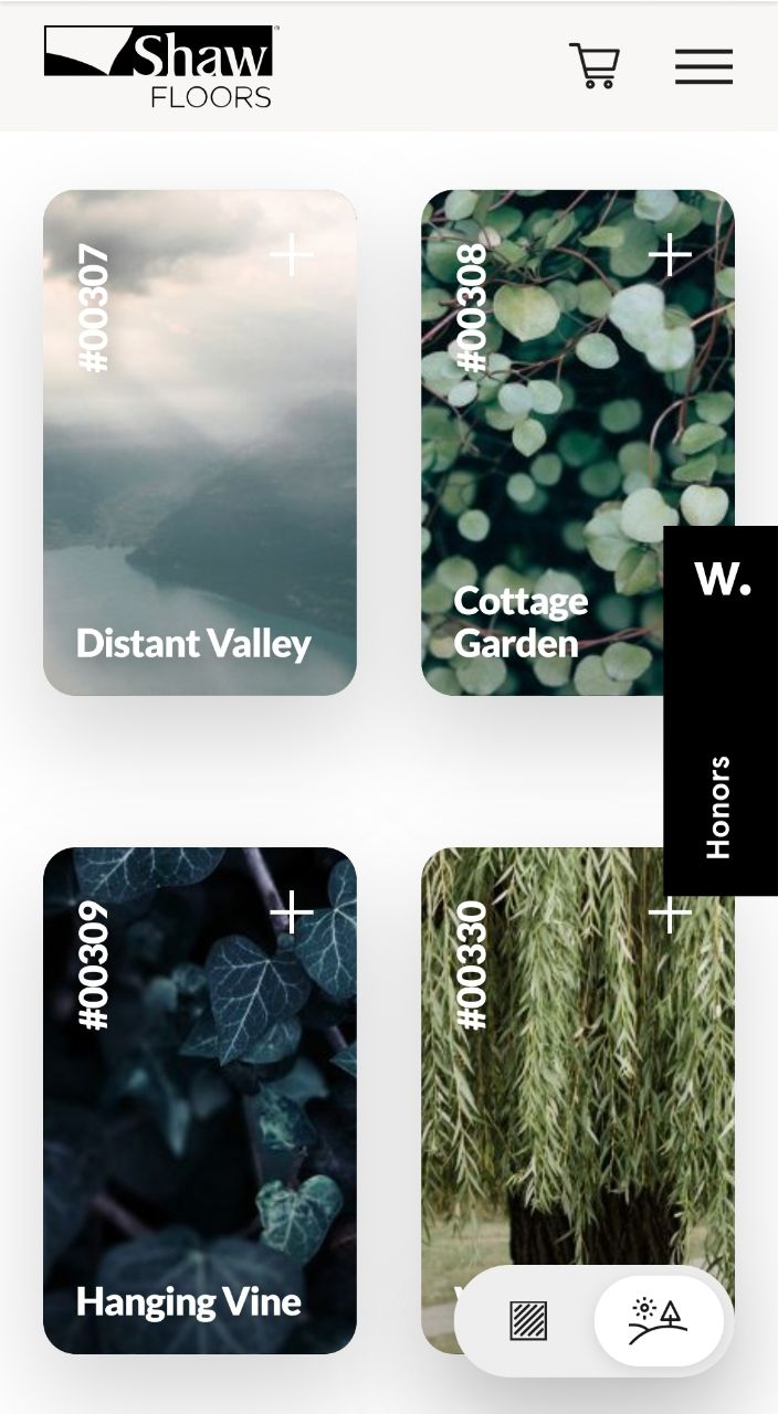
Color Speaks
Color Speaks has found an ideal way to tell their brand’s story and also to demonstrate products. Short text snippets are embedded into the long wall of product samples in the form of tiles that turn into small beautiful pictures when you hover on them. These pictures are critical to understanding the brand story.
On smartphones, where you have no cursor, hovering needs an alternative. That is why Color Speaks has added an extra widget that allows users to instantly change the view of sample tiles. This makes the process of browsing convenient and intuitive.

Now it’s your turn to create a perfect mobile design!
These were our ten examples of outstanding mobile design. We hope you found the inspiration you were looking for! Stay creative and don’t be afraid of bold ideas and experiments! If you manage to achieve the balance between the original look and positive user experience on mobile devices, you’ll be golden!